T-shirts and tanks
The category level shows item performance and comparison within the category. Click any plot image for full size.
Item listing
Times worn
Total times worn to date. Green line items are divested, gray still in use. Green areas show 1 and 2 SD ranges for divested items. 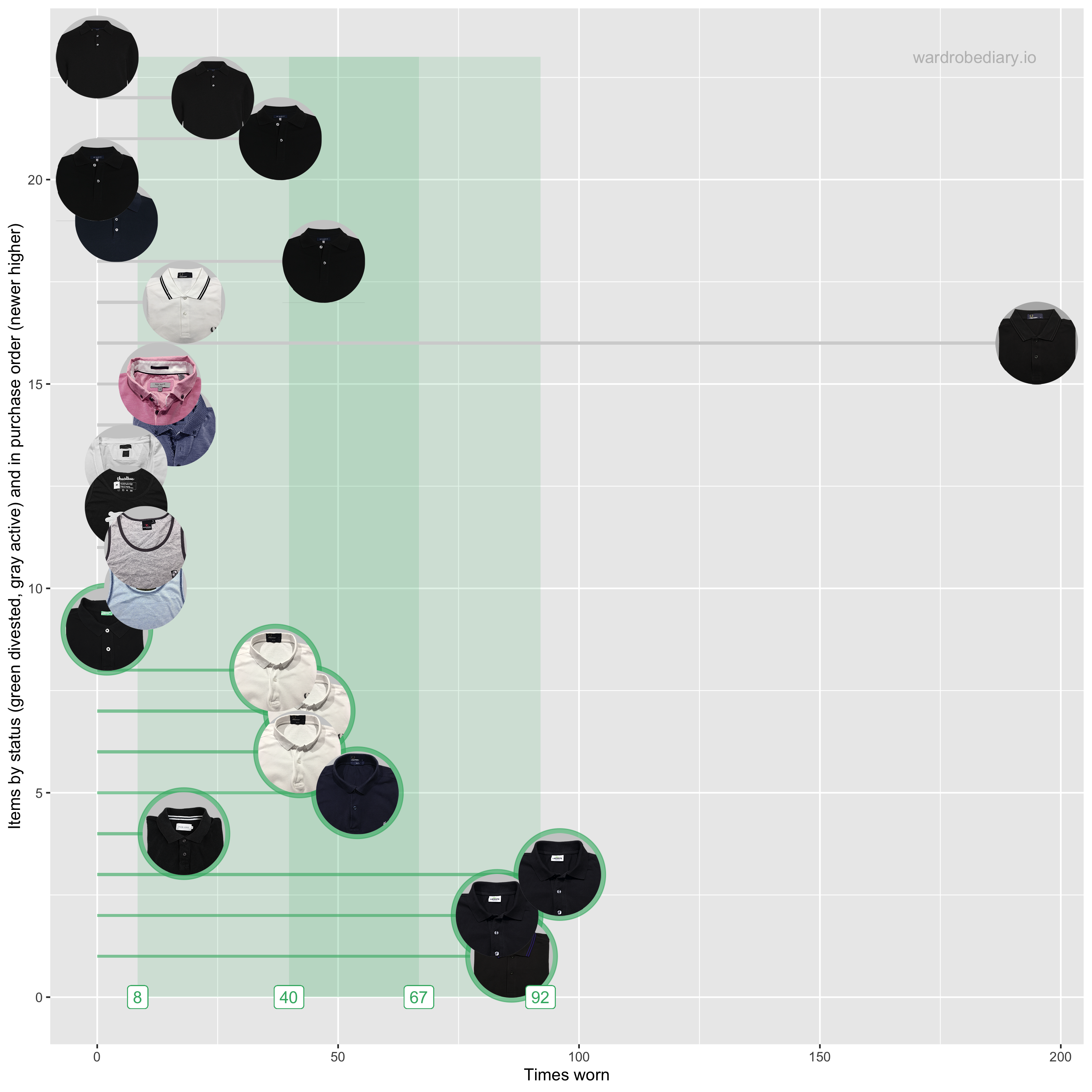
Cost per wear and times worn
Gray dots trace the use of each item. Blue dots are guide trajectories for items with purchase prices of 5, 10, 20, 50, 100, 200, 400, and 800 EUR. 
Cost per wear and frequency of use
Dotted lines show average values for the total use to date of all divested items. 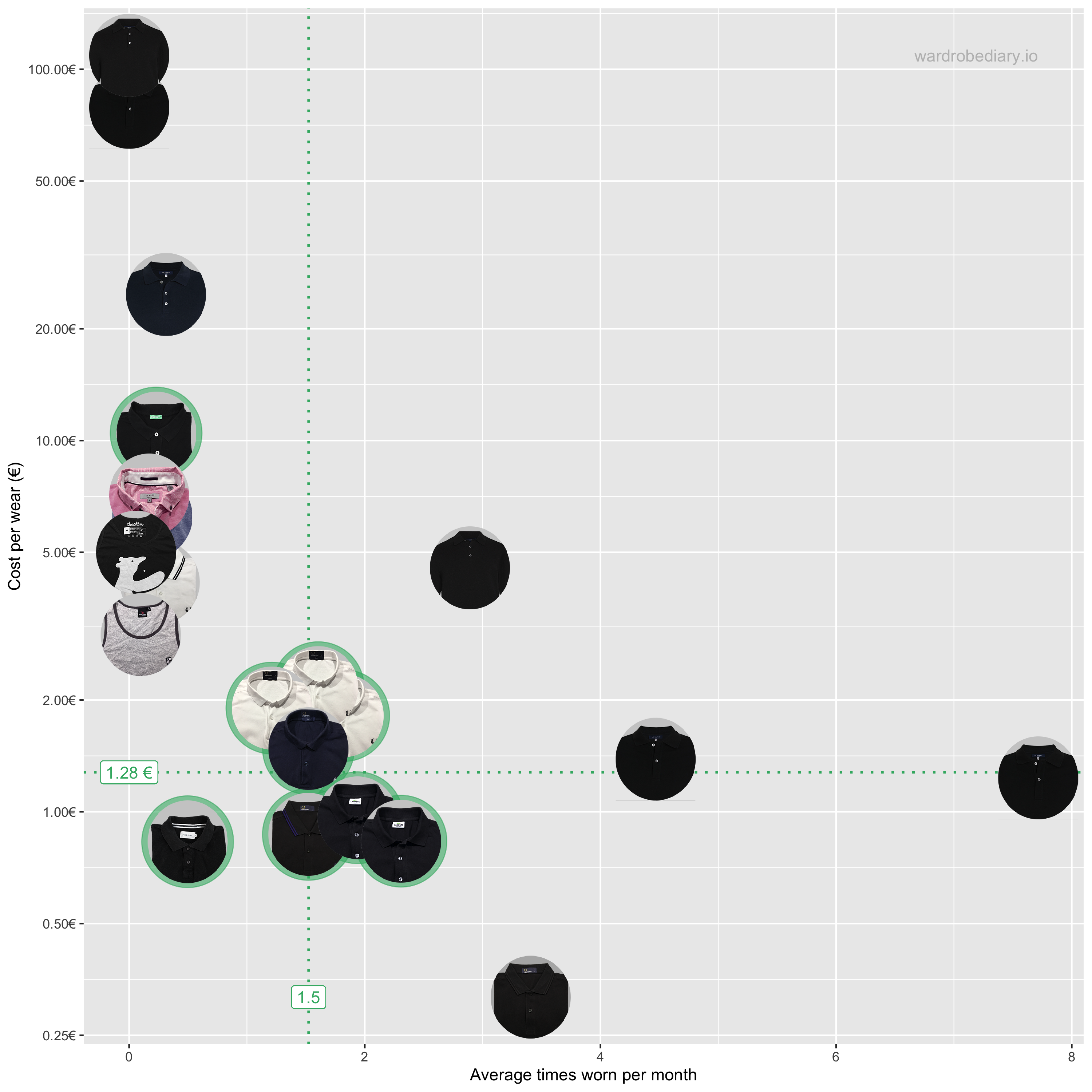
Times worn - Animated by date
Historic progression. Green line items are divested, gray still in use. Green areas show 1 and 2 SD ranges for divested items. 
Cost per wear and frequency of use - Animated by date
Historic progression. Dotted lines show average values for the total use to date of all divested items to that date. 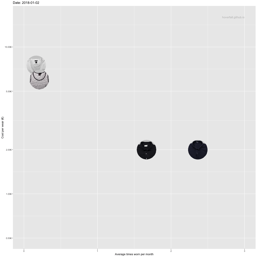
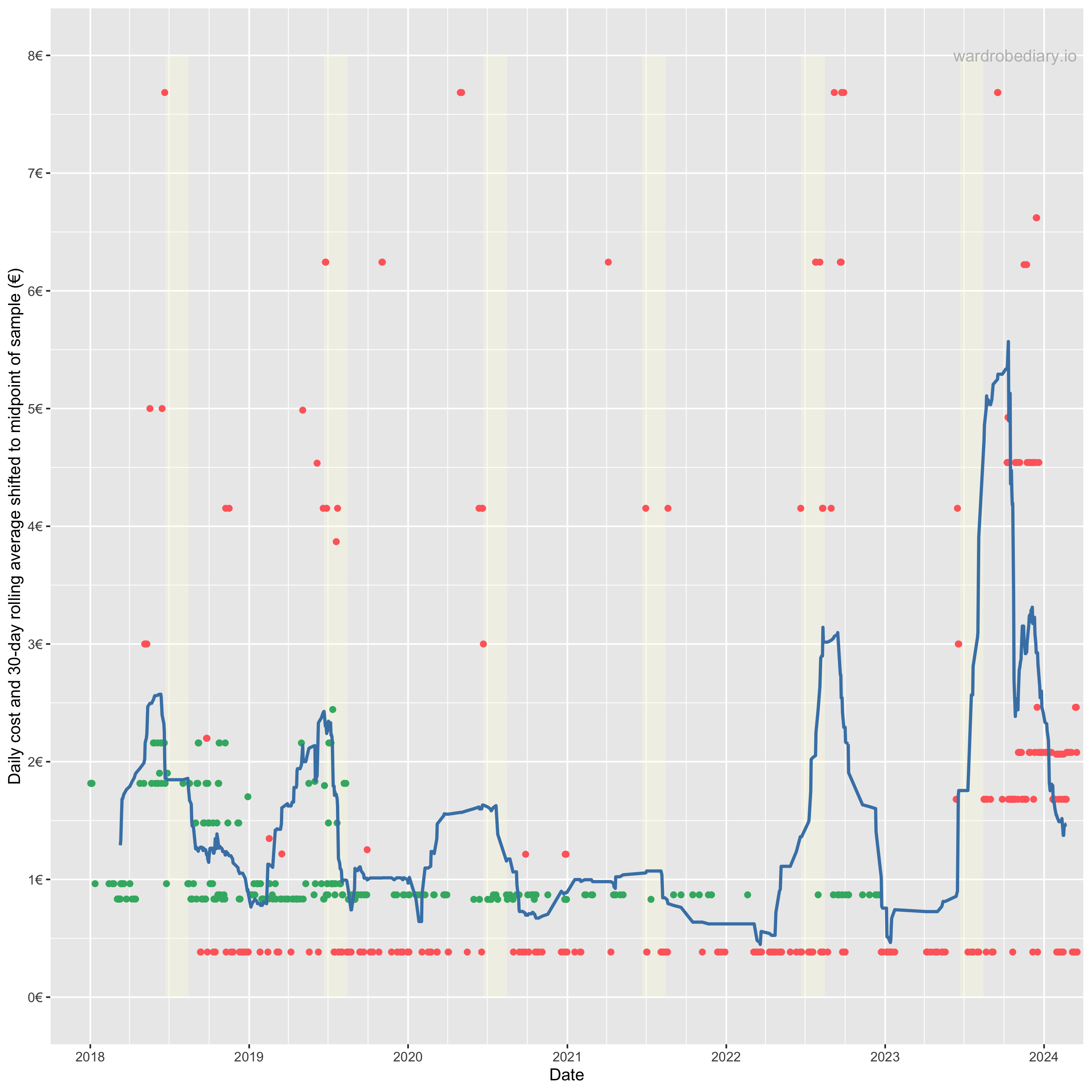
Daily cost
Daily cost of category item(s) worn. Green means the daily cost is final and no longer changes. Red means it may still decrease with future use.